Oh the joy of statistics…
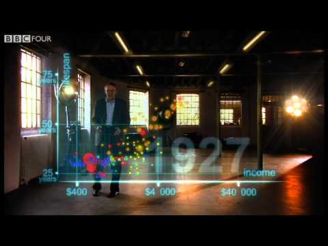

I found that to be remarkably positive in its outlook of overall progress. It seems that often we look at poverty and progress with a very depressed view of it, but this quick video shows the exact opposite. Although there clearly is plenty of room to improve, we can see that humanity is becoming more prosperous overall. I am interested to know whether or not inflation was taken into account with those increases in income, since that would play a huge role in the optimistic perspective of the world which he shows.
The life expectancy ratings were very interesting, however in my mind a very deep philosophical question arises which is, how old do we want to be before we die? It is clear that we are headed toward having the ability to stay alive much much longer, however much of this is due to drugs which limit our consciousness. My question is whether or not we want our life expectancy to increase as drastically as it is. (keeping in mind the dilemma with social security which has been created due to increasing levels of population and life expectancies)
By: Greg Cameron on January 25, 2011
at 5:21 pm
Wow this video is fascinating! It definitely shows a more optimistic view of how the world’s nations have progressed over the past few centuries; we tend to think that those countries in poverty would be in the lower left hand “poor and unhealthy” section, but as this showed, even they are moving up in the world. I found this video especially helpful and interesting in understanding everything, seeing as I am a visual learner. By watching the nations move and change throughout time, it creates a more clear overall picture of how development is shaping these countries, health- and money-wise. Kudos to them for the graphics!
Yet, at the end of the video, something he said made me think about the future. He said that “it’s fully possible that everyone can make it to the healthy, wealthy corner.” What would the world be like if everyone were healthy and wealthy? I feel like a lot of our world’s trade and relations rely on some countries to be poorer than others, and some organizations and countries find it beneficial to outsource to poorer nations. Also, kind of like Greg mentioned above, if everyone has a higher life expectancy, that may have very significant impacts on our world. There’s only so much room for people to live, and higher life expectancies can lead to vast overpopulation. Ultimately, it makes me wonder: is it worth it for everyone in the world to become healthier and wealthier?
By: Katie Dobbs on January 26, 2011
at 10:43 am
I found this movie very interesting. It’s intriguing how cities can be a few miles from each other and have completely different life expectancies. It also makes me wonder how with all the technology and advancement in medicine we have how we still have people who are dying at such young ages! Even though the United States is aware of this, it seems like we don’t do enough and citizens for the most part don’t seem to really emphathize with poverty even though it’s present in our own country. It’s difficult to have expectations of our citizens to help poverty stricken countries when we can’t even help the homeless on our own streets. These poverty stricken countries do have the capacity to live longer and healthier lives; however, it does not seem realistic anytime soon. Countries have different philosophies, laws, and governements than the United States, and we can’t just impose our ways on theirs.
By: Emily Norman on January 26, 2011
at 5:49 pm
What an effective visual representation of global development over the past two centuries of human existence. The pause that is made in 1948 is a very crucial time frame to identify. Essentially, 1948 represents the tipping point of the world into widespread globalization and the spread of Western practices and ideals throughout much of the world. The decolonization of European powers from Africa was in effect, a war torn Europe was being rebuilt under the guidance of the United States and the stage was being set for the opening up of many Asian countries.
Also, this visual representation clearly demonstrates the assertions that Jeffery Sachs forms in regard to physical geography as a major contributor to extreme poverty in many countries. The visualization shows the deviation of life expectancy and income between the two Chinese geographical regions of Guizhou and Shanghai. The crucial difference is that Shanghai benefits from developed trade and production due to its close vicinity to the ocean. Guizhou conversely endures the lowest GDP ($1,502) of all Chinese providences due to its rural location and agrarian based populations. Although this specific poverty trap of geographic location is somewhat intuitive, it is a major contributor to human suffering that can be remedied through development.
By: Carson W. Bowlin on January 26, 2011
at 11:42 pm
Wow! What an interesting video. I found the way he chose to present his information and findings to be state of the art and visually stimulating. By taking the 120,000 points of information and organizing it in this manner, it provides a lot of insight into how the countries around the world have developed over time. Overall, the outlook is very positive in that there is an upward trend for the world. However, it is still obvious that the African nations are lagging behind all others. These are the nations who should be receiving the most aid from the rest of the world. I almost think it would have been even more effective for him to keep China and other countries broken up to show more of an actual representation than an average of those countries. What is promising about Africa, however, is that the average life expectancy has greatly increased over time. This was the trend with the Asian countries, who are now also progressing along the income axis.
It would be interesting to see if he could forecast future trends of countries and estimate by what year the rest of the world will catch up to the most developed countries. The most interesting parts of the video had to be when he slowed down the time and showed the impact of WWI and the Spanish Influenza, as well as how quickly these countries rebounded. The other interesting part was how China is comprised of two completely different areas within itself (Shanghai and Guizhou). This is a sign that maybe the government needs to take over and do a better job of establishing equal living standards.
By: Ben G on January 27, 2011
at 11:30 am
I remember seeing this video around the time it was first released, but am more able to grasp the ideas presented after revisiting it. What I find most interesting is not just how much the world has developed, but how wealthy nations have over time diverged from the developing nations. This in many ways reminds me of chapter 2 of The End of Poverty, where Sachs claims most of the world was poor 1820 and in a matter of less than two centuries of an economic boom we have seen such drastic differences of wealth and health throughout the world. Overall the video presents much optimism, especially when showing emerging markets catching up to the western world and showing the world as a whole moving upward.
By: Ian Nordstrom on January 29, 2011
at 4:13 pm
It was really interesting how the first world war affected so many countries life expectancy. At least half of the countries represented in the graph dropped. Also, it was amazing when he split off provinces of China and one was as well off as Italy and the other was as bad as Pakistan. This kind of puts into perspective the how inaccurate and skewed some of the data on countries can be. One good and wealthy province can affect the status of a country a ton and throw off the statistics on other countries. This makes me wonder how quickly China’s economy as a country is really growing. Could it be the majority of the country growing or is it possible that one or two main provinces in the country are dragging along a multitude of provinces that are still where they were 50 years ago?
By: Tim on February 1, 2011
at 12:32 pm
I think this is a great way to present statistics in a manner where people will enjoy watching and at the same time be impacted by the stats. It is interesting that a province can be split between wealthy and long lives and poor and shorter life expectancy. The affect of the world wars and the advancement of premier countries, or the lagging of poorer countries, after those wars is also interesting.
By: Luke Boyer on February 24, 2011
at 6:07 am
I too found this video interesting because I’ve never seen statistics on health over two centuries time. I too find it interesting the cities within a country can have completely different health standards among its population. I guess it’s just hard to imagine. It’s interesting though because you hear about how society today don’t have as strong as immune systems as we used to. You also hear about all these new super viruses coming into existence, but yet the statistics on the video show that the overall health of the world population as a whole has only been increasing with time. Its amazing that something such as the industrial revolution or other similar events really do change humans interactions with the environment and especially survival from things such as disease, illness, and viruses. I’m curious to see if the current world recession will have any major effect on health?
By: Nick Johnson on February 24, 2011
at 6:55 am